

I designed a new navigation and information architecture for the Jellyfish engineering management platform. It increased discoverability of Jellyfish features and content. Users also preferred it over the old navigation.
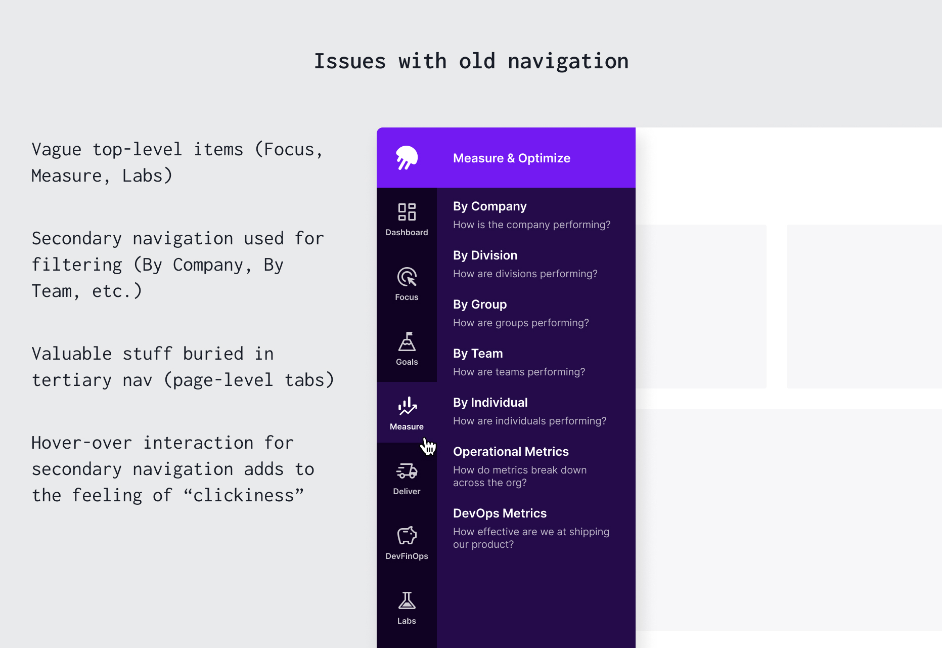
New users struggled to navigate Jellyfish's complex application, visiting only 11% of pages and showing poor retention. Experienced users found our navigation slow and inefficient. Our navigation structure also hindered product development flexibility and led to pages with an ever-increasing number of tabs and limited options when adding new features.
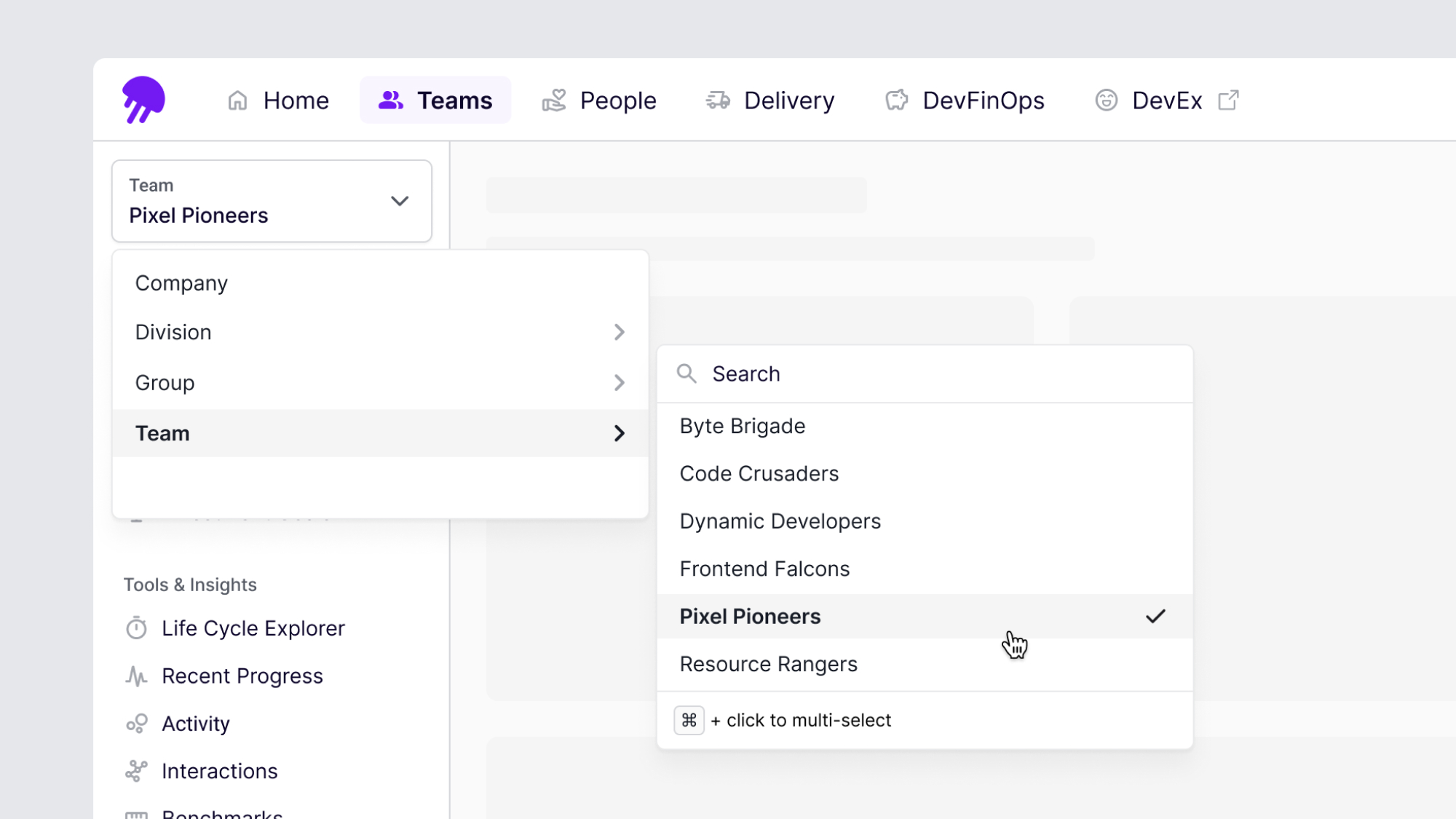
We conducted a card sorting activity and semi-structured interviews using a few proposed information architecture options. A primary finding was that engineering leaders separated team-level tools and information from individual-level tools and information. They described management of delivery teams and people/career management as two different “modes” that they consciously switched between. This informed our eventual decision to establish distinct sections for Teams and People in our new information architecture.
We also conducted a series of small in-app experiments to test navigation ideas and lay the technical groundwork for a larger rebuild. These included:
The updated navigation consists of a top bar for top-level options, a collapsible left-anchored side bar for secondary options, and page-level tabs for tertiary options.
We also took the opportunity for a visual refresh, moving from a higher contrast dark-against-light navigation elements to a light-on-light approach (or dark-on-dark when in dark mode). This allows page content to take primary focus.

First, the new navigation improved discovery of Jellyfish experiences and increased usage of the platform. For new Jellyfish users who were given the new navigation, we saw a ~100% increase in views of distinct pages, and a ~245% increase in total page views when compared with new Jellyfish users who were given the old navigation. We also saw a ~95% increase in days with Jellyfish usage.
Additionally, Jellyfish users showed high adoption of the new navigation. 87% of existing users who were given the new navigation with the ability to opt at any time out never did so. Another 6% opted out but opted back in later. Only 2 users who opted out reported the inability to accomplish a task or a preference for the old navigation.
Qualitative feedback showed that Jellyfish users preferred the new navigation to the old:
The secondary navigation bar can be collapsed to gain additional real estate. An icon button appears on hover to expose the expand/collapse action.

The Teams section secondary navigation includes a team picker which sets the context for all the experiences in the section. We learned that the majority of Jellyfish users look at one or a few teams, and would therefore change teams sparingly, if at all. Team selection persists across sessions to maximize continuity.
There are two versions of tertiary navigation. The vertical variant (left) is used for pages with many subsections (~9+) and/or sections of unknown size (i.e., user-editable sections). The horizontal variant is used for sections with ~8 or fewer sub-sections.
