
I designed a scenario planning tool for engineering leaders. It has been praised for its intuitiveness and has become a key competitive differentiator for Jellyfish.
Engineering leaders are typically faced with tradeoff decisions to ensure they deliver high priority work on time and within budget. In other words, what happens if they add more developers to the project? Or remove competing priorities? Or cut project scope?
Leaders have traditionally relied on homespun spreadsheets or “finger in the wind” methods to answer these questions. And while Jellyfish provided projected completion dates, it didn't show how to get projects back on track.
In collaboration with team, I designed a scenario planning tool that enables engineering leaders to explore tradeoffs for any deliverable (epic, initiative, etc.). Through conversations with Engineering Managers, Release Managers, and others, we identified three key levers:

Scenario Planner opens in a modal where users can adjust each lever and see real-time impacts on projected timelines. It also provides contextual data for each lever, including a list of the developers on the project, a list of competing priorities, and a list of the remaining issues in the project.
We also collaborated with a Data Scientist to update our model for projected completion dates. The old projection model was simply based on the number of remaining issues left in the project. The new model incorporated the number of developers and the amount of focus on each project, allowing Scenario Planner to serve as the “explainer” for our projections.
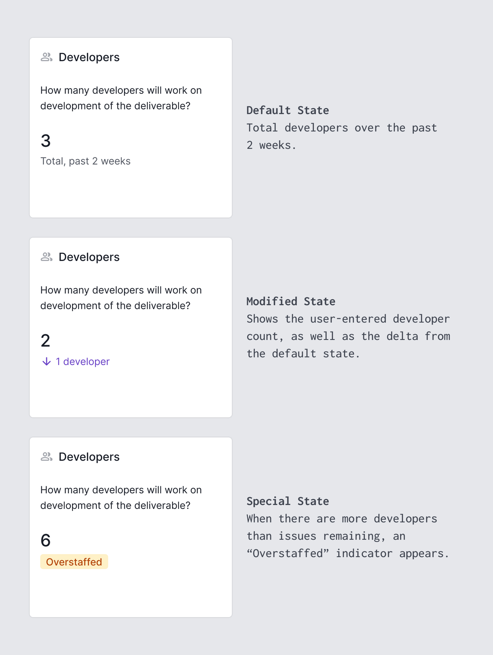
Through frequent customer feedback, we addressed several key friction points. We initially allowed users to generically edit the number of developers with a number input. However, we learned that it was much more intuitive and useful for users to choose specific developers by name. We also added more data to express plan impacts, including the remaining effort in person-weeks, the remaining “calendar time” in days, and projected cost in dollars.
One of the most frequent customer requests was the ability to plan for multiple projects at once. This led to the development of another planning tool called Capacity Planner.
Prior to general availability, we observed positive signals in terms of feature usage, with evidence of significant usage of all three of our core planning inputs. We also saw positive signs in terms of feature retention, with significant numbers of users returning to the tool over the weeks following their first use. This included evidence of early power users and even “power organizations,” where multiple people within the same organization/team adopted the tool.
We received significant positive feedback about the feature in terms of its intuitiveness and ability to drive positive conversations around delivery tradeoffs. One customer estimated that they were able to save about $130k by proactively course-correcting with Scenario Planner, and estimated $1.5m in annual savings. Scenario Planner has also become a key competitive differentiator and frequent topic of sales conversations.
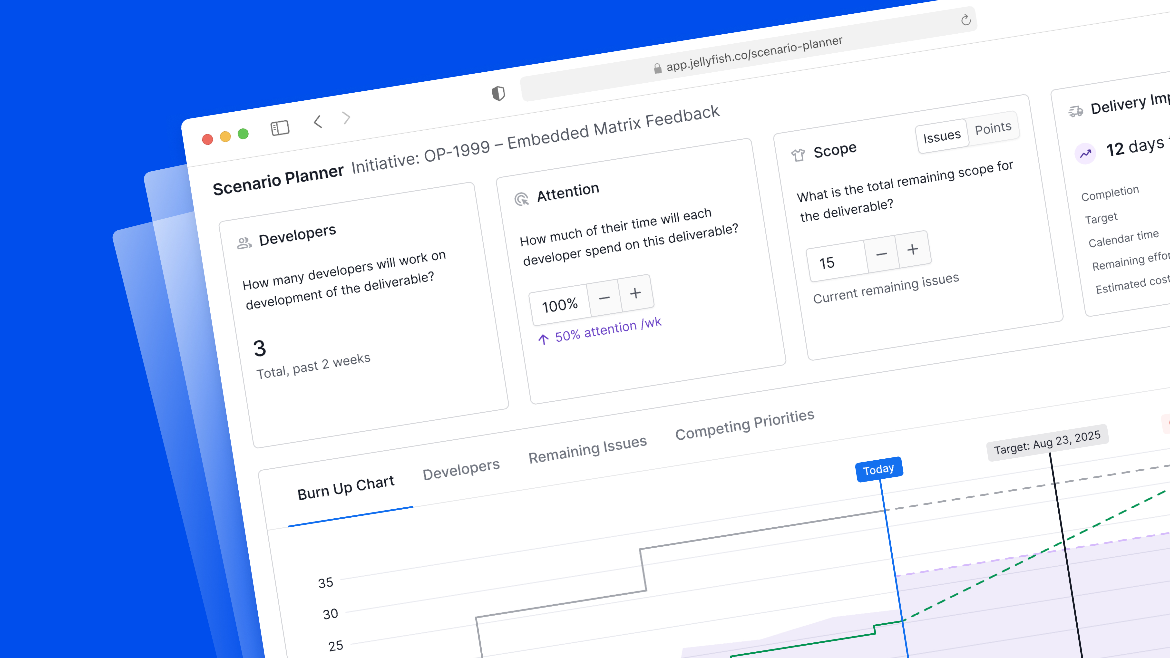
Scenario planner is contained within a modal window that is opened from any deliverable details page. By default, it shows the current state of the work item. But users can modify developers, attention, and scope to see how those changes impact delivery timelines.

By default, the Developers, Attention, and Scope cards show current data based on the past 2 weeks. The cards update as users explore different delivery scenarios.
The results of the scenario inputs are summarized in multiple ways, including time to delivery, remaining effort, and cost in dollars.

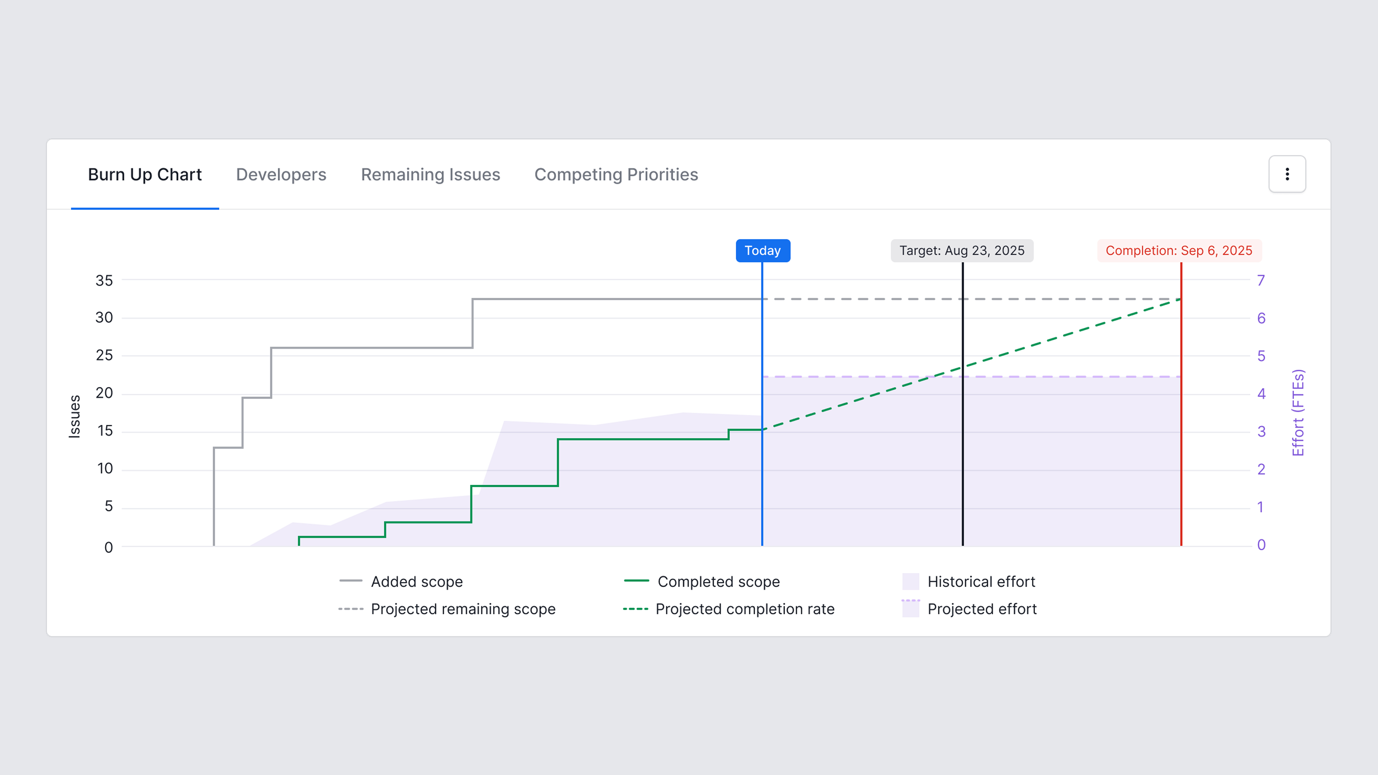
A burn up chart shows historical and projected values for scope, completed scope, and effort towards the project. The projected values update as Scenario Planner inputs are modified.
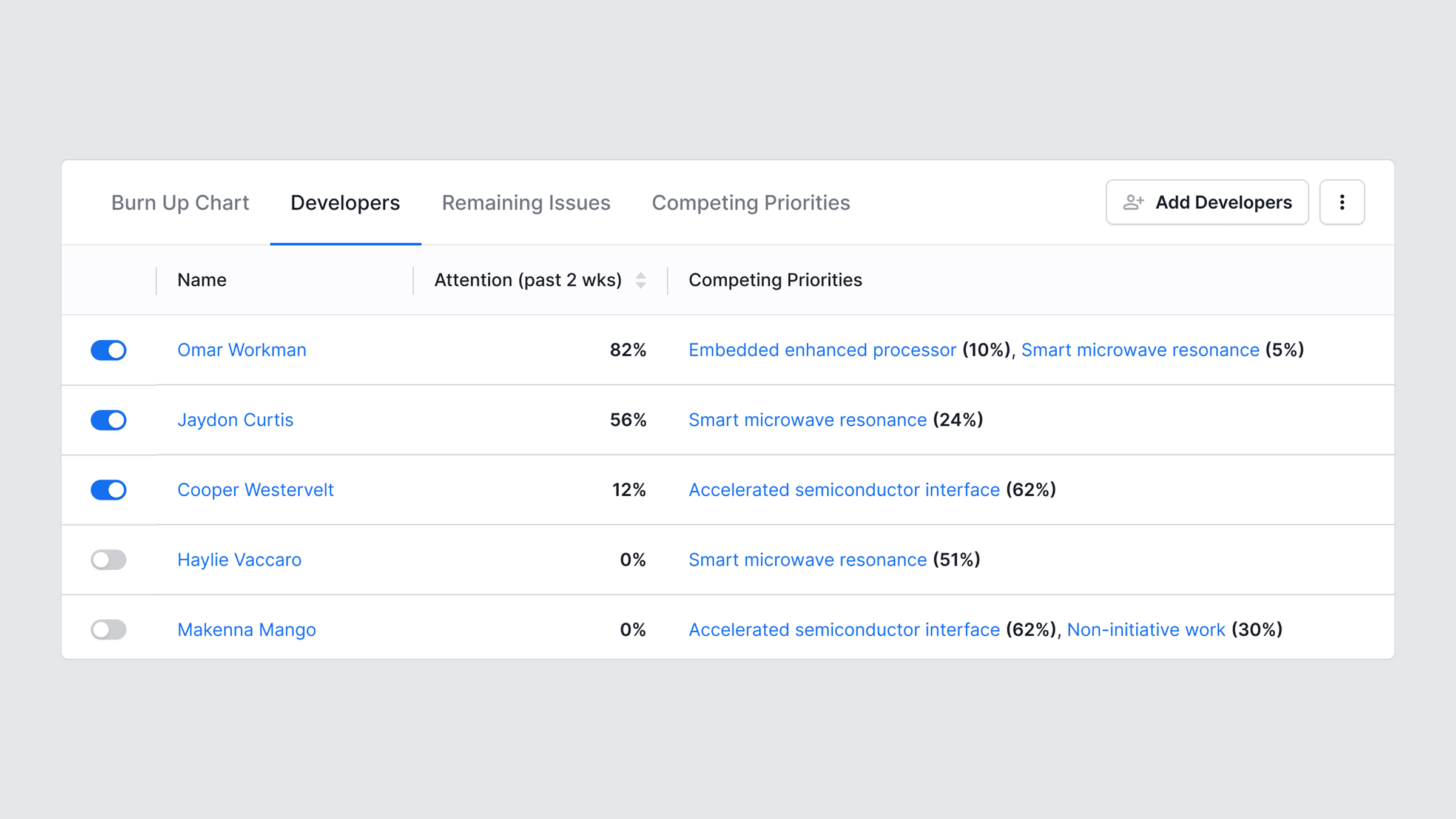
The other tabs provide information to support decision-making around the scenario plan inputs of developers, attention, and scope. For example, the Developers tab shows the people who have contributed to the deliverable over the past 2 weeks. It also allows developers to be added or removed from the plan.
Users can access an exportable plan summary which describes the before/after and projected results of the plan.
